

Quick Summary
Premium screen printing means the ink sits cleanly on the fabric, stays flexible, and holds its color through repeated washing. You can identify it by feel, since a soft hand and thin, even ink signal quality, and by checking that color layers line up with sharp edges.
- Run your fingers over the design: a soft, flexible print that bends with the fabric is a good sign.
- Stiff, rubbery or raised prints often indicate heavy, low-grade ink.
- Check registration: crisp edges where colors meet mean careful setup.
- Ask the seller which ink type they use and on what fabric.
- Wash inside out in cold water with no fabric softener to help prints last.
Table of Contents
- How to Identify Premium Screen Printing on a Tee
- Why Print Quality Matters More Than the Design
- Test the Print by Touch: Hand Feel and Ink Thickness
- Inspect Registration and Alignment Before You Buy
- Compare Plastisol and Water-Based Ink Durability
- Check Curing, Crack Resistance and Fabric Color Effects
- How to Keep Graphic Tees From Fading Over Time
- Using a Wash Test and Microscope Check to Verify Quality
- Choosing Your Next Shirt From Free Thought Supply
- Frequently Asked Questions
How to Identify Premium Screen Printing on a Tee
Last Updated: November 2, 2026
Why Print Quality Matters More Than the Design
Before you buy a graphic tee, look past the joke on the front. A clever design on a poorly printed shirt will crack, fade, and feel stiff after a few washes. At Free Thought Supply, we believe a good idea deserves a print that lasts, so knowing how to identify premium screen printing helps you buy once instead of twice.
Premium screen printing means the ink sits cleanly on the fabric, stays flexible, and holds its color through repeated washing. Cheap prints do the opposite. They can look fine in the product photo and then break down in the laundry.
Here is why this matters for thinkers who wear their ideas:
- The design is the conversation starter, so it should stay sharp
- Cracked or faded prints make a shirt look worn out fast
- A stiff, heavy print can feel uncomfortable against the skin
- Quality prints usually reflect better garment and ink choices overall
Test the Print by Touch: Hand Feel and Ink Thickness
The easiest test takes ten seconds. Run your fingers across the design without pressing hard.
A well-made print feels almost like part of the fabric. This is often called a soft hand. A thick, rubbery layer that sits on top of the shirt usually signals heavy ink application or a cheaper process.
Watch for these signs:
- Soft and flexible: The print bends with the fabric
- Thin but even: No raised edges or lumps
- Stiff or plastic-like: Often a sign of heavy, low-grade ink
- Rough patches: May point to uneven coverage
A common mistake is judging only the color. Bright colors can hide a thick, uncomfortable print. Always feel the design before you decide.
Inspect Registration and Alignment Before You Buy
Registration is how accurately each color layer lines up with the others. Poor registration causes blurry edges, ghosting, or colors that spill outside their shapes.
Check the details in product photos or in person:
- Find the smallest text or thinnest lines in the design
- Look for crisp edges where two colors meet
- Confirm there are no doubled outlines or shadows around the letters
- Look at the same area on the back or sleeve if photos show it
Sharp registration suggests careful setup and proper screen tension. Fuzzy lines often mean rushed production.
Compare Plastisol and Water-Based Ink Durability
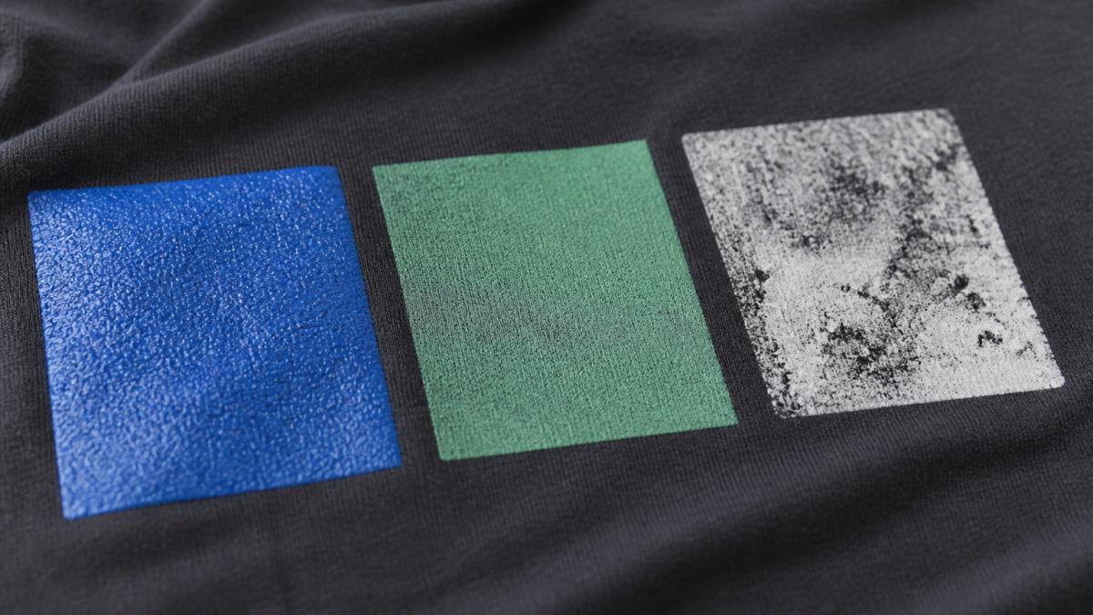
Most screen printed shirts use one of three ink families, and the chemistry behind each one explains why a print feels and ages the way it does. Knowing the mechanism helps you judge a finished shirt instead of trusting the label.
**
| Ink type | How it bonds | Feel | Durability when cured well | Best for |
|---|---|---|---|---|
| Plastisol | Fused layer on top of fabric | Thicker, noticeable | High; resists cracking and fading | Bold color, large designs, dark shirts |
| Water-based | Binder locks pigment into fibers | Very soft, breathable | High; can fade gracefully rather than crack | Soft-hand prints, light garments, retail-quality tees |
| Discharge | Bleaches dye, replaces with pigment | Nearly invisible | High on cotton; depends on dye lot | Vintage looks on dark 100% cotton |
Ink type alone does not decide quality. Ask the seller which ink family they use and on what fabric, then judge the finished shirt by feel, stretch, and edge sharpness.
Check Curing, Crack Resistance and Fabric Color Effects
Curing means heating the ink so it bonds to the fabric. Under-cured ink washes out, peels, or feels tacky. Over-cured ink can turn stiff or yellow.
Good prints generally show even color with no tacky or sticky spots, resistance to cracking when you gently stretch the fabric, and colors that look consistent across the whole design.
How to Keep Graphic Tees From Fading Over Time
Even a premium print needs good care. Heat and harsh detergent cause most fading and cracking.
Try these steps:
- Turn the shirt inside out before washing
- Use cold water and a gentle cycle
- Skip fabric softener, which can coat the print and weaken it
- Air dry or use low heat in the dryer
- Never iron directly over the design
These habits protect the print for much longer. A premium print handles them well, while a cheap one often fails after a few rough cycles.
Using a Wash Test and Microscope Check to Verify Quality
Two objective checks, a standardized wash test and a low-power magnification inspection, can give you evidence a product photo cannot.
The home wash test protocol
Run this before you commit to a bulk order, using a single sample shirt:
- Baseline photo. Photograph the print flat, in daylight, next to a ruler or coin for scale. Note any existing cracks, pinholes, or edge lift.
- Wash 1, inside out, cold water, gentle cycle, mild detergent. No fabric softener, no bleach. This is the standard care most premium printers recommend and the condition a good print should survive easily.
- Air dry flat or tumble on low. High heat is the single biggest cause of cracking, so keep it out of the first test.
- Compare. Re-photograph in the same light. Look for new cracks along the print's flex lines, edge lift, color shift, or a chalky haze.
- Repeat to five washes. A premium print should look essentially unchanged after five cycles. A cheap print typically shows cracking, flaking, or dulling by wash three.
A pass looks like this: color holds, edges stay sharp, the print still stretches with the fabric, and no flakes come off on your fingers when you rub the design. A fail looks like: cracks that widen when you stretch the shirt, ink that peels at the edges, or color that has gone patchy.
The magnification check
A jeweler's loupe (10x-20x) or a phone macro lens is enough to see what the naked eye misses. Hold the shirt flat and inspect three things:
- Ink penetration. On a water-based or discharge print, the ink should sit in the weave with the fiber texture still visible through it. On plastisol, the ink should form a smooth, continuous film with no pinholes or thin spots where the fabric shows through.
- Halftone dot quality. If the design uses halftones, the dots should be round and evenly spaced, with clean edges. Ragged or merged dots signal a worn screen, poor tension, or too much squeegee pressure.
- Edge sharpness. At 10x, the boundary between two colors should be a clean line, not a feathered or doubled edge. A fuzzy edge at magnification is the earliest visible sign of poor registration.
These checks take only a few minutes and a basic loupe.
Choosing Your Next Shirt From Free Thought Supply
When you shop, use the checklist above: feel the print, check the registration, ask about the ink, and read the care notes. If you are ready to compare options, see the best science themed shirts for adults to browse popular picks. These steps help you spot quality whether you buy from us or someone else. To weigh your options, you can read alternatives to SnorgTees for science shirts.
Our graphic tees and sweatshirts are designed for independent thinkers who want ideas that look sharp and last. Visit Free Thought Supply to browse the collection and find a design worth wearing every day. Pricing depends on the product and order details, so check the Free Thought Supply website for current prices or a quote.
Frequently Asked Questions
How can I tell if a graphic tee is screen printed or DTF?
Look at the edges and texture. Screen printed ink usually sits on top of the fabric with a slightly raised, consistent layer, and the design often shows visible halftone dots when you look closely with a magnifier. DTF prints tend to have a thin, flexible film-like finish with no visible dots, and the image may look slightly smoother or more photographic. Feel the print too: plastisol screen prints feel thicker and rubbery, while water-based prints feel soft and close to the fabric. If the print looks perfectly uniform with no dot pattern and feels slightly plasticky, it is more likely DTF.
Does premium screen printing fade after washing?
Quality prints resist fading when they use proper curing and enough ink layer thickness. Plastisol inks, fully cured at the correct temperature, typically hold color through many wash cycles, especially when the garment is washed inside out in cold water and dried on low heat. Water-based inks soak deeper into the fabric and feel softer, but they depend more on careful curing and can fade faster if the shirt is over-dried. Ask the seller about their curing process and wash testing before you assume a print will last.
What is the difference between plastisol and water-based screen printing?
Plastisol is a PVC-based ink that sits on top of the fabric, producing vibrant colors, strong opacity and good crack resistance, but a heavier hand feel. Water-based ink absorbs into the fibers, producing a softer feel and a more natural look, though it can be less opaque on dark garments and requires precise curing. Neither is automatically better. Plastisol suits bold designs on a budget, while water-based ink suits designs where a soft hand matters most.
How do you check for proper print registration on a shirt?
Registration means each color layer lines up with the others. Check multi-color designs at the edges of letters and shapes for gaps, overlaps or blurry halos. Look for thin white or colored slivers where two inks should meet, and confirm that repeated elements sit at the same position on both sleeves or both sides of a shirt. Clean, sharp edges and tight alignment usually indicate careful screen setup and proper screen tension.
